My brief was to create a realistic interpretation of a music magazine by designing a front cover , contents page and a double page spread and to use at least four original images. This project started off with a simple understanding of how music magazines operate , getting the necessary information across and keeping their popularity up , by completing a preliminary test which enabled the understanding of conventions . Furthermore , I began to chose magazine front covers , contents pages and double page spreads to analysis and get a general oversight of the chosen genre. I researched these magazine pages on a website called Blogger . Blogger is a site were anyone can create a profile and share their thoughts . My thoughts were on the magazine designs ; layouts , the use of images , colours , text. All the conventions I found were as to how they were used ; for instance Masthead Title piece, Price ,Date ,Issue number, Barcode ,Teaser ,Main feature , Headline ,Subtitle ,Smaller feature Images , Font ,Colour , pulls/tag/ear, by line, teaser , letter from editor. Strap lines are their to give an insight of the headline , explaining briefly what the contents is about. Most magazine use a house style which I like as it shows continuity within the pages. Overall at this point there is nothing I dislike about the conventions of a magazine.
Subsequently , the planning began when I understood the ways a music magazine operates and appeals to the audience. Firstly , I designed a masthead ( Musique - French for Music) , I chose this masthead because it was simple and would easily recognisable. Furthermore , I took the idea further and used dafont.com ( where there are thousands of fonts to chose from for free) to collect similar font styles and post them on my blog. Secondly , I arranged and re-arranged the fonts to see which one fitted my chosen alternative house style. Additionally I began to create simple designs on paper which I scanned in . These plans were basic for example; headlines were just written as 'Headline'. These plans were just a guideline to my general layout . Consequently I then created crisper sharper plans using Photoshop, still these plans were very basic no real text just the names of conventions that may be used. Once the basic idea was out on paper and on documents I began to look for the ideal model to pose as my artist. I found a female model who listen to alternative music and dressed similar to the popular audience. Conjointly , I began to take the photos . I planned to take photos with a guitar and have the model in relaxed poses such as crossing legs or leaning against the wall. I had chosen these poses and props because I believe they fitted the alternative genre and added to the Mise-en-scene of the images; co notating that this is a passionate pure music magazine . Finally , I felt pleased with the photos , they looked aesthetically pleasing but they were very plain , simple and slightly boring. I then considered to have a re-shoot of these images this time I researched the perfect pose. In addition I found a perfect pose on the front of an NME magazine with the lead singer from pulp swearing . This image was powerful and eye-catching. Therefore I took the pose further and began to construct the models stance and posture , giving her props such as cigarettes which would co notate the rebellious teenage audience . As soon as I was happy with the overall appearance of my images I began to edit and recreate the NME front cover style. I really enjoyed taking these photos and arranging them into a realistic magazine. At this moment in the project it felt like everything was coming together and becoming apparent , I was very pleased with the direction which my project was taking.
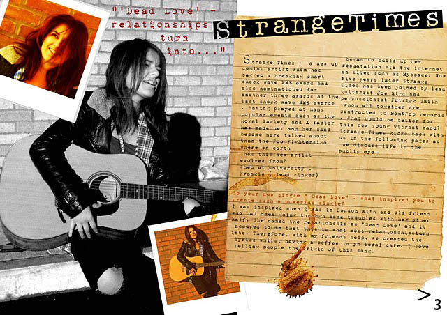
Following the pleasing photo shoots , I began to create layouts with the photos and mould into the house style. I did achieved this by looking back at my inspirational NME issue and looked at how other magazines used this house style. For instance I looked through the artists that featured in the magazines and looked at the way they created a house style. For instance with the contents page , I used an internet found image ( Chair with plain wall ) . I really liked the way the image was so simple yet looked perfect for a contents page yet it is unconventional because it doesn’t convey the usual layout , this makes the magazine original . The chair was a symbol of an interview chair indicating that the bottom section would be used for main interviews only. Although I found this image and was perfectly happy with the overall image I still wanted to change this about it ; i.e. levels and curves. I did this to make the chair more apparent on the page . The chair also as a bonus creates a basic layout to work with , this helped create a layout that I was happy to work with. Furthermore , my double page spread breaks many conventions such as the overlaying of a coffee stain but this has been used to link all the contents of the page together and makes the page more pleasing and personal; giving the reader a connection with the artist. I used a catch line to lure the reader into reading this page without the catch line I believe the page would still lure people in but the reader wouldn’t know what to expect from the article. My three main images used on this page are very strong and I really like the overall composition on the double page. Although I like these images and the layout , my audience feed back did not agree with me ; they thought the double page was busy but still fit the house style. 60% of my audience would read this page if it appeared in a magazine. Secondly , my article was extremely difficult to write. I decided to write about a song that my artist has released and I wanted it to be a little unique , instead of my artist describing her song writing in a studio I described her writing it with a friend ; again I believe this made it more personal. This is the main reason it is written on a torn out page , to make it appear like a diary page . I also used columns on the above text because this wasn’t part of the interview and to give a general overview of my artist for the readers benefit. I really enjoyed creating this page because I liked changing my own magazine’s conventions with the use of different text layouts( columns), overlaying pictures ( Polaroid image , coffee stain. I have broken these conventions to break the obvious conventions which all readers expect making the pages look more interesting and exciting.Overall, I was pleased and happy with the way the project was taking shape. Then I realised I should make a colour theme . Furthermore I looked through the work that I has produced and looked at the way each page connected ; I noticed colours like reds ( Colour hair) and blues ( The chair image ) and oranges ( Brick walls behind main images) , from here I concluded to work with these colours and work with them to compliment each other. The main theme that I stuck to was the sepia style creating an aged appearance. Sepia was created through Photoshop ; Photoshop has been used throughout the project and with the large use of Photoshop made me learn more about the software . I learnt techniques like using levels , curves , sepia , text settings , clone tools , enhancing , and filter.
Levels – (can move and stretch the brightness levels of an image histogram. It has the power to adjust brightness, contrast, and tonal range by specifying the location of complete black, complete white, and midtones in a histogram)
- I used the levels for most of my images , mainly to re-adjust the levels that the camera may have defaulted wrongly.
Curves - (curves is central to their practice because it affects light's two primary influences: tones and contrast)- I tried not to use the curve tool as it can sometimes destroy the image .
Sepia - (A sepia tone is a reddish brown monochrome tint. When applied to a photo, it gives the picture a warm, antique feeling)- I used sepia to help create a continuous colour theme. Similar to the red and blue.
Text settings – (Leading , Kerning and tracking, Faux styles , Scaling and moving, Case and caps)- Using text in Photoshop was very difficult , the text never went where you placed it , the process was very tedious and mundane. I found entering text on to the page easy by making the text an image and editing around the text image.
Clone tools – (Photoshop's clone stamp tool allows you to duplicate part of an image.
The process involves setting a sampling point in the image which will be used as a reference to create a new cloned area)
- The clone tool came in handy with the photographs that I took because in some images the background isn’t right or my model has a blemish which needs getting rid of. I mainly found this tool very easy to use .
Enhancing tools – ( Enhancing involves the manipulation of colours within an image )
- I like using this tool because it allowed me to make the image more interesting and aesthetically pleasing
Filter tool – ( Filters are used to change the appearance of an image, layer or selection in Photoshop. In this tutorial, I’ll introduce you to some common filters, and show you how to use them )
- I used this tool to enhance the lighting and give a sepia filter to give the impression that these are old images.
In my media product I believe I did challenge any of the usual conventions within the contents page and double page ( They both challenge the layout ). I developed and used all the conventions of a music magazine by using strong images; my front cover for instance has a strong image of my artist swearing , this gives off a rebellion controversial use of body language. Yet in my opinion the image fits my house style with the use of Mise-en-scene with the props; guitar and cigarettes. On the other hand the use of fonts for headlines and strap lines which are again very similar to any other magazine ( as they are needed to be a functional magazine). Conventional headlines like mine are supposed to be eye catching and lure the reader in, this can be done through a play on words or the colours used in the font. Finally I have formed my magazine around the basic magazine conventions for example ; barcode , price , issue number , issue date. On the other hand for my contents page I used my own images from concerts and live gigs ; these are placed on this page to again lure the reader to look at the images and want to read the article. Furthermore the use of regulars and features gives the reader a choice of contents to look at ; features would be a new artist or an irregular article . For example my artist on the front page is the main feature this links the two pages together with the continuous use of the same artist. The contents page was voted the most appealing page out of the three I made; the feedback described the page as being different , interesting and quirky ( The positive feedback allowed me to feel more confident about these pages). Subsequently , the double page spread is the same artist again to show continuity. My double page spread is my favourite page because the images used tie in with the context of the article ; with the use of the coffee ring when it talks about having a coffee , I believe this makes it more personal for the read with the artist. Moreover , looking back at my preliminary task and how my way of working has changed I have noticed that my work has become more strong and noticeable. For instance the front cover is the main page I can focus on because they differ in many ways ; mainly the way I display my images and the composition of the images. Other conventions such as headlines and strap lines have been developed from the preliminary task to the real project. I believe that if I had spent as much time as I had done on my brief apposed to my preliminary task , both pieces of media would be of good quality and standard. Furthermore , without one of the many conventions I used in the brief the music magazine would be ruined and unconventional.
In conclusion I am very pleased with the outcome of my music magazine , if I could change anything about this project it would have to be my time management. I understand that this project was a heavy time consuming project which I believe I took to and understood quickly. Overall I am overwhelmed with the finished products and now wouldn’t change anything about my pages or anything on my blogger.